
Building and maintaining a component library can be a challenging task. From component creation to accessibility compliance, release management, and visual consistency, numerous aspects must be considered.
To make the process more manageable, here are five must-have tools that can help streamline your workflow and enhance the quality of your library.
1. The component gallery: Discover Reusable Components
 https://component.gallery/components/
The component gallery is a platform for sharing and discovering UI components, making it easy to find and reuse components already built by others. You can search for and find components that match your needs and use them as a base in the development process.
Whether looking for a specific component or just browsing for inspiration, the component gallery is a valuable resource for anyone building a component library.
2. Plop JS: Streamline Component Creation
Creating new components from scratch can be time-consuming and repetitive. Sometimes there are a set of files that you need to copy from other components and replace the names. Plop JS is a code generator that can simplify the process by providing a clean and easy-to-use interface for generating components.
With this tool, you can define templates for different types of components and quickly generate new components that meet your specific needs, saving time and effort, and allowing you to focus on other important aspects of your library.
Let's take the previous example where you need to create a set of default files every time you want a new component. To do that, install Plop.js with npm:
npm install plop --save-devCreate the configuration file in your project's root directory and add the following code:
// ./plopfile.js
export default function (plop) {
  plop.setGenerator("create-component", {
    description: "Create a new React component",
    prompts: [
      {
        type: "input",
        name: "name",
        message: "What is the name of your component?",
      },
    ],
    actions: [
      {
        type: "add",
        path: "src/components/{{name}}/{{name}}.tsx",
        template: "plop/component.tsx",
      },
    ],
  });
}
We are creating only one file upon command, but you can add other templates in the actions field such as test, types, and index files. Finally, create the template:
// ./plop/component.tsx
import { FC } from "react";

interface {{name}}Props { }

const {{name}}: FC<{{name}}Props> = (props) => {
  return <div>{{name}} component</div>;
};

export { {{name}} };
export type { {{name}}Props }
In your terminal, run the following command to generate a new component:
npx plop create-componentFollow the prompt to enter the name of your component, and Plop JS will generate a new component in your src/components directory.
3. Storybook A11y Plugin: Ensure Accessibility Compliance
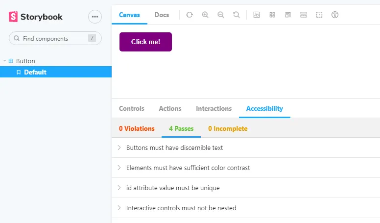
At this point, your component library is expected to be using Storybook to showcase its components. Storybook is a popular UI component development tool, and the A11y plugin is a necessary addition to ensure that your component library is usable by a wide range of users, including those with disabilities.
The plugin uses axe-core, an accessibility testing engine, to run accessibility tests on your components. The tests cover a wide range of accessibility issues, including missing alternative text for images, incorrect use of semantic elements, and poor color contrast, providing immediate feedback on any issues that need to be fixed.
In addition to identifying accessibility issues, the plugin can also help you make your components more accessible by providing guidance on how to fix the issues. For example, if a component is missing alternative text for an image, the plugin will suggest adding alt text to the image.
This helps you maintain a component library that is inclusive and compliant with accessibility standards.
4. Semantic Release: Automate Your Release Process
Managing releases can be a tedious and time-consuming task, especially for large component libraries. Semantic Release is a tool that automates the release process based on the Git history of your project, allowing you to focus on developing components without having to worry about the release process.
To start, install the semantic-release package as a dev dependency:
npm install semantic-release --save-devNext, you'll need to set up a .releaserc file in the root of your project. This file will contain the configuration for semantic release, including the GitHub repository, the GitHub API token, and the release type (major, minor, or patch). Here's an example of a .releaserc file with multiple plugins:
{
  "plugins": [
    "@semantic-release/commit-analyzer",
    "@semantic-release/release-notes-generator",
    "@semantic-release/github",
    "@semantic-release/npm"
  ],
  "github": {
    "repository": "owner/repo",
    "token": "secret"
  }
}
Finally, you'll need to set up a CI/CD pipeline to run semantic release. In this example, we'll use GitHub Actions. To do this, create a workflow file in the .github/workflows directory. Here's an example of a workflow that runs semantic release:
name: Semantic Release

on:
  push:
    branches:
      - main

jobs:
  release:
    runs-on: ubuntu-latest
    steps:
      - name: Checkout code
        uses: actions/checkout@v2
      - name: Setup Node.js
        uses: actions/setup-node@v2
        with:
          node-version: 14
      - name: Install dependencies
        run: npm ci
      - name: Run Semantic Release
        run: npx semantic-release
With these steps in place, semantic release will run automatically every time you push changes to your main branch. The tool analyzes your Git history (e.g.,feat:, fix:), determines the type of release (major, minor, or patch), and publishes the release to the appropriate channels (e.g., npm). This saves you time and eliminates the possibility of human error in the release process.
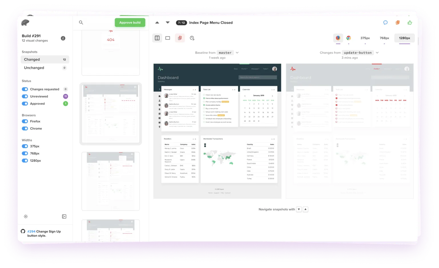
5. Percy: Verify Component Consistency
 percy.io
Ensuring visual consistency in your components is critical for maintaining a high-quality component library. Percy is a visual regression testing tool that makes it easy to test your components and detect any visual changes that may occur. With this tool, you can quickly and easily compare screenshots of your components to ensure that they look and function as expected, making it easier to catch and fix any visual issues before they become a problem.
To get started, sign up for a Percy account and create a new project. Then, install the @percy/cli and @percy/storybookpackages:
npm install --save-dev @percy/cli @percy/storybookNext, set up a script to run Percy for your Storybook environment in your package.json file:
"scripts": {
  "percy": "percy storybook http://localhost:6006"
}
You'll also need to configure Percy in your .env file with your API token and project ID:
PERCY_PROJECT=<your-project-id>
PERCY_TOKEN=<your-api-token>
Finally, you can run your Percy snapshots by running the following command:
npm run percyPercy will take screenshots of your components in various states and compare them to the previous version of the component. If there are any differences, Percy will highlight them in the visual report. This allows you to quickly identify and fix any visual issues with your components.
By incorporating visual regression testing into your development workflow with Percy, you can ensure that changes to your component library do not result in unexpected visual changes. This helps you deliver high-quality components that are consistent and reliable.
Conclusion
Incorporating these five tools into your development workflow can help you build and maintain a high-quality component library with ease. Whether you're a seasoned developer or just starting out, these tools will make your workflow smoother and enhance the development experience when working on your library, saving you time and effort in the process.