 Image generated on Midjourney by Milton Boos Junior
Have you ever had that components folder that kept getting copied from one project to another just to reuse good custom components? Or are you in a company with multiple frontends that have duplicate components? If you answered “yes” to either one of these questions, then it's time you create your own components library!
These libraries are almost indispensable in environments with a code base in constant evolution and with many components shared by several teams.
This article serves as a comprehensive guide for setting up your React component library from the ground up. You will learn how to create the library, showcase individual components, bundle using modern tools, and automatically publish it as a package for others to consume.
I'll demonstrate how by using the following tools:
- React (TypeScript)
- Storybook
- Rollup
- GitHub Actions
- GitHub Pages
- GitHub Packages
1. React
Let's start by setting up the React component library using the TypeScript template.
npx create-react-app my-component-library --template typescriptClean and organize your files the way you like, just remember that your main index.ts file should export your components instead of the default <App />. Make sure to change the name field in the package.json to the @git-user/my-component-library format.
For the sake of simplicity, let's create a React component that returns a <button/>. While you can create other components, just remember that React recommends that component libraries use the forwardRef hook to automatically pass a reference through a component to one of its children.
// ./src/components/Button/button.tsx
import { ReactNode, forwardRef, ComponentPropsWithoutRef } from "react";

interface ButtonProps extends ComponentPropsWithoutRef<"button"> {
  children: ReactNode;
}

const Button = forwardRef<HTMLButtonElement, ButtonProps>(
  ({ children, ...props }, ref) => (
    <button {...props} ref={ref}>
      {children}
    </button>
  )
);

Button.displayName = "Button";

export { Button };
export type { ButtonProps };
Finally, export this component in the main index.ts.
// ./src/index.ts
export * from "./components/Button";
2. Storybook
For now, we can't see how our components look in isolation, so we'll also install Storybook to visualize them.
npx storybook initStorybook will create default stories at /src/stories, but you can remove them as they are just examples of how you can take advantage of Storybook to showcase your components. Let's create a simple story for our Button!
// ./src/components/Button/button.stories.tsx
import { Button } from "./button";

export default {
  title: "Button",
  component: Button,
};

export const Default = () => <Button>Click me!</Button>;
Now, let's check it!
npm run storybook3. Rollup
We have our tiny component library ready, but we still need to bundle everything. That's where Rollup comes to the rescue!
npm install --save-dev rollup @rollup/plugin-commonjs @rollup/plugin-node-resolve @rollup/plugin-typescriptConfigure it so that Rollup uses the main index.ts as the input, and bundle it to commonjs and esmodules. For TypeScript support, use the @rollup/plugin-typescript, but exclude unnecessary test and Storybook files.
// ./rollup.config.js
import resolve from "@rollup/plugin-node-resolve";
import commonjs from "@rollup/plugin-commonjs";
import typescript from "@rollup/plugin-typescript";

const config = {
  input: ["./src/index.ts"],
  output: [
    {
      file: "build/index.cjs.js",
      format: "cjs",
      sourcemap: true,
    },
    {
      file: "build/index.esm.js",
      format: "esm",
      sourcemap: true,
    },
  ],
  plugins: [
    resolve(),
    commonjs(),
    typescript({
      tsconfig: "./tsconfig.json",
      declaration: true,
      declarationDir: "build",
      exclude: ["**/*.test.*", "**/*.stories.*", "./src/test-utils/*"],
    }),
  ],
  external: ["react", "react-dom"],
};

export default config;
Change the package.json to use Rollup's build instead of react-scripts. Finally, change main and module to the respective commonjs and esmodules outputs. Make sure to specify the types declaration file in the types field.
"main": "build/index.cjs.js",
"module": "build/index.esm.js",
"types": "build/index.d.ts",
"scripts": {
  "build": "rollup --config",
},
4. Github
By now you should already have some commits in your GitHub repository, so let's take advantage of other GitHub tools to publish our package seamlessly.
First, let's add these fields to the package.json:
"repository": {
  "type": "git",
  "url": "git+https://github.com/juniorboos/my-component-library.git"
}
All you'll have to do next is create the release workflow using GitHub Actions! This workflow will be triggered with every release published on GitHub, installing dependencies, and building and publishing the library to the GitHub Package Registry. Don't forget to change node-version to the one you are currently using.
# .github/workflows/release.yml
name: Release

on:
  release:
    types: [published]

permissions:
  contents: read
  packages: write

jobs:
  release:
    runs-on: ubuntu-latest
    steps:
      - name: Checkout
        uses: actions/checkout@v3
      - name: Setup node
        uses: actions/setup-node@v3
        with:
          node-version: 16
          registry-url: https://npm.pkg.github.com/
      - name: Install dependencies
        run: npm ci
      - name: Build
        run: npm run build
      - name: Publish
        run: npm publish
        env:
          NODE_AUTH_TOKEN: ${{ secrets.GITHUB_TOKEN }}
This is enough to automate the component library package release. Now you must go to your repo's releases and create the first one!
First, choose a tag. Then, pick a good title, write a description, and publish!!
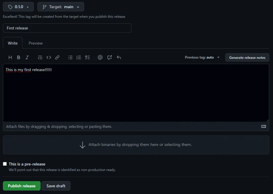
This will automatically trigger a release with the new package's version. A reproduction of this can be found on my GitHub.
Conclusion
Setting up a React component library can be a great way to increase efficiency and consistency in your development process. By using tools such as Storybook, GitHub, and Rollup, you can create a centralized location for your components, document them, and easily share them with others.
Remember to keep your library up to date, document your components well, and test them frequently, in order to ensure that your library is meeting the needs of your team.